NEUBRAINER, the official blog of Neubrain

NEW! Infographic and Technology Brief: Data Visualization

Posted by Yana McConaty

If data dictates our decisions, then why would we allow key information to sit idle simply because it is too hard to reach or too time-consuming to understand or even uncover? More than ever, decision-makers must accelerate how quickly they collect, consume, interpret and analyze data. 

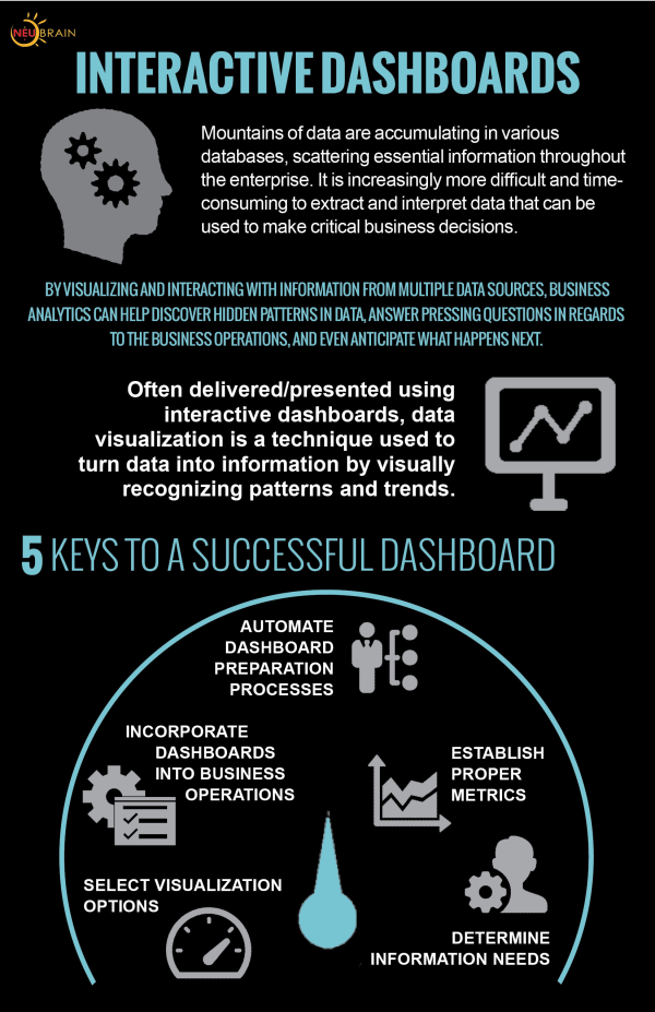
In the following infographic, we introduce data visualization, a technique used to display data in a consolidated and organized fashion.

PLUS! In our new technology brief, we take a deeper dive into this approach and teach you about the benefits of interactive dashboards as well as the best practices and methodologies used to successfully implement them at your organization. 

LEARN MORE! DOWNLOAD THE TECHNOLOGY BRIEF NOW!


Interactivedashboardsinfographic 091913 resized 600


Topics: interactive, dashboards, implementation, methodology, visualization, dashboarding, reporting, dashboard, metrics, interactive dashboards


Follow Me

Sign-up to Receive Neubrainer Updates

Neubrainer 

neu·brain·er |n(y)o͞o brān ər|
noun

  • Neubrain’s official blog featuring expert advice, industry news and analysis, innovative ideas, and more. Did you read today’s post on Neubrainer?
  • An important tip or fact from Neubrain experts; Improve cost-efficiency and foster interdepartmental communication by implementing a performance-based budgeting solution-- it’s a Neubrainer.